Case StudyTurning searches into trusted connections
Leading the research strategy to understand why over 2 million monthly searches weren't converting into meaningful connections -and using those insights to redesign the Yellow Pages business directory experience.
Brand
Yellow PagesMy Role
UX Research, Design StrategyMethods
Interviews, Workshops, A/B Testing, User Testing
Discovery Research
In-depth interviews and landscape review to understand how Australians search for, evaluate, and choose service providers.
Behavioural Insights
Scenario-based tasks and Dovetail tagging to surface authentic decision-making behaviours beyond self-reported accounts.
Stakeholder Alignment
Research showcases, a centralised insights repository, and workshop facilitation to embed a shared understanding of users across the product team.
Evidence-based Design
Research principles translated directly into a redesigned business profile page — then validated through user testing and live A/B testing.01. The Challenge
High traffic.
Lowering conversions.
Yellow Pages had successfully made the transition from trusted print directory to online platform, attracting over 2 million searches for service providers every month. But the numbers told a more complex story - the rate of users actually connecting with those providers had been steadily declining.

This wasn't a traffic problem. The existing directory experience was cluttered, text-heavy, and misaligned with what people actually needed when they were trying to decide who to hire. Analytics pointed to high drop-off rates and poor lead quality, but the data couldn't explain why.
Design Challenge
How can we optimise the online directory to foster high-quality connections between users and service providers?
The CX team was also navigating an internal challenge: the broader product organisation lacked a unified understanding of who their users were and what they needed. My role extended beyond running research - it included building the structures that would make those insights accessible and actionable across the whole team.02. Research Approach
A staged approach to discovery
I built a dynamic, staged discovery plan that moved between gathering, understanding, defining, and testing - continuously feeding insights back into the process rather than treating each stage as a one-way gate.01 - Gather
Setting the foundation
Stakeholder interviews
Research recruitment
Research planning
02 - Discover
Understanding the User
Landscape & competitor review
In-depth user interviews
03 - Define & Design
From Insight to Direction
Personas & journey mapping
Experience & design principles
Ideation workshops
04 - Iterate
Test and Validate
Moderated user testing
Live A/B testing
Iterative refinement
A key part of my remit was ensuring the wider product team was brought along throughout - not just presented with findings at the end. I introduced regular research showcases and established a centralised research repository in Dovetail, creating a self-serve source of truth that teams could reference and build on independently.03. Discovery Research
Understanding the users
decision making process
Before running interviews, I conducted a landscape review - analysing competitor platforms and customer reviews to benchmark best practices, identify gaps, and understand the broader ecosystem influencing how people find and hire service providers. This ensured our primary research had a good foundation to start from.

I facilitated 15 in-depth interviews with recent service hirers across Australia, conducted online. Each session used a scenario-based task to surface authentic behaviour - what people actually do under pressure - rather than relying on what they remembered or thought they did.

Every session was tagged in Dovetail, making the full dataset searchable and accessible for the wider team.“I need to know that a provider is reliable, trustworthy and accredited so that I feel confident they can do the job properly.”
01
Trust precedes action
Users needed confidence in a provider's reliability, accreditation, and track record before they were willing to make contact. The platform wasn't surfacing this information at the right moment.02
Information gaps create anxiety
When key details were missing or buried, users didn't search harder - they left. Incomplete profiles created uncertainty that consistently drove drop-off rather than engagement.03
Control reduces overwhelm
People felt overwhelmed when forced to contact a provider before they felt ready. They wanted to explore at their own pace - gathering evidence until they reached a personal threshold of confidence.
The interviews were synthesised into a research report highlighting key themes and actionable insights. I then built a visual journey map - designed not just as a deliverable but as a living document - so that insights remained accessible and continued to shape decisions well beyond the initial research phase.04. From Insight to Direction
Translating research into
design direction
Before moving into ideation, I translated the research into a set of clear design principles and product requirements. Without a shared strategic direction, our workshops risked generating ideas disconnected from real user needs. The principles acted as both a brief and a filter throughout the design process.Insight
“Users need clear, visible trust signals to move forward - without them, confidence drops and decision-making is delayed or abandoned.”
Users struggled to assess whether a provider was reliable, accredited, or trustworthy from the business profile page alone - a critical point of decision-making.If we design for this →Design principle: Anchor trust signals - accreditations, verified reviews, and clear business details - prominently on the profile. Make it easy to verify at a glance, before a user has to ask.I facilitated ideation workshops in collaboration with the product designer, bringing together stakeholders from Product, Marketing, and Tech. Before ideation activities began, I ensured the attendees were aligned on the personas, journey map, and key research findings - using visual aids and structured activities so that ideas were grounded in evidence from the start.05. The Outcome
The re-designed profile
The research directly shaped the redesign of the Yellow Pages business profile page - the most critical touchpoint between users and service providers. The new experience was built around the trust and control signals the research had identified as non-negotiable for users.A tabbed structure dynamically adjusted based on service category, aligning the content hierarchy with the specific decision-making needs of different customer types (e.g. information needed while looking for a plumber vs a lawyer). Trust-building information was anchored prominently, so users could verify credibility quickly without having to dig.On mobile, the structure also influenced the menu and sticky navigation - ensuring the primary call-to-action was always accessible at the point when a user felt ready to connect. The redesign was validated through moderated user testing before being measured in production through live A/B testing - building an evidence base that supported further investment and refinement.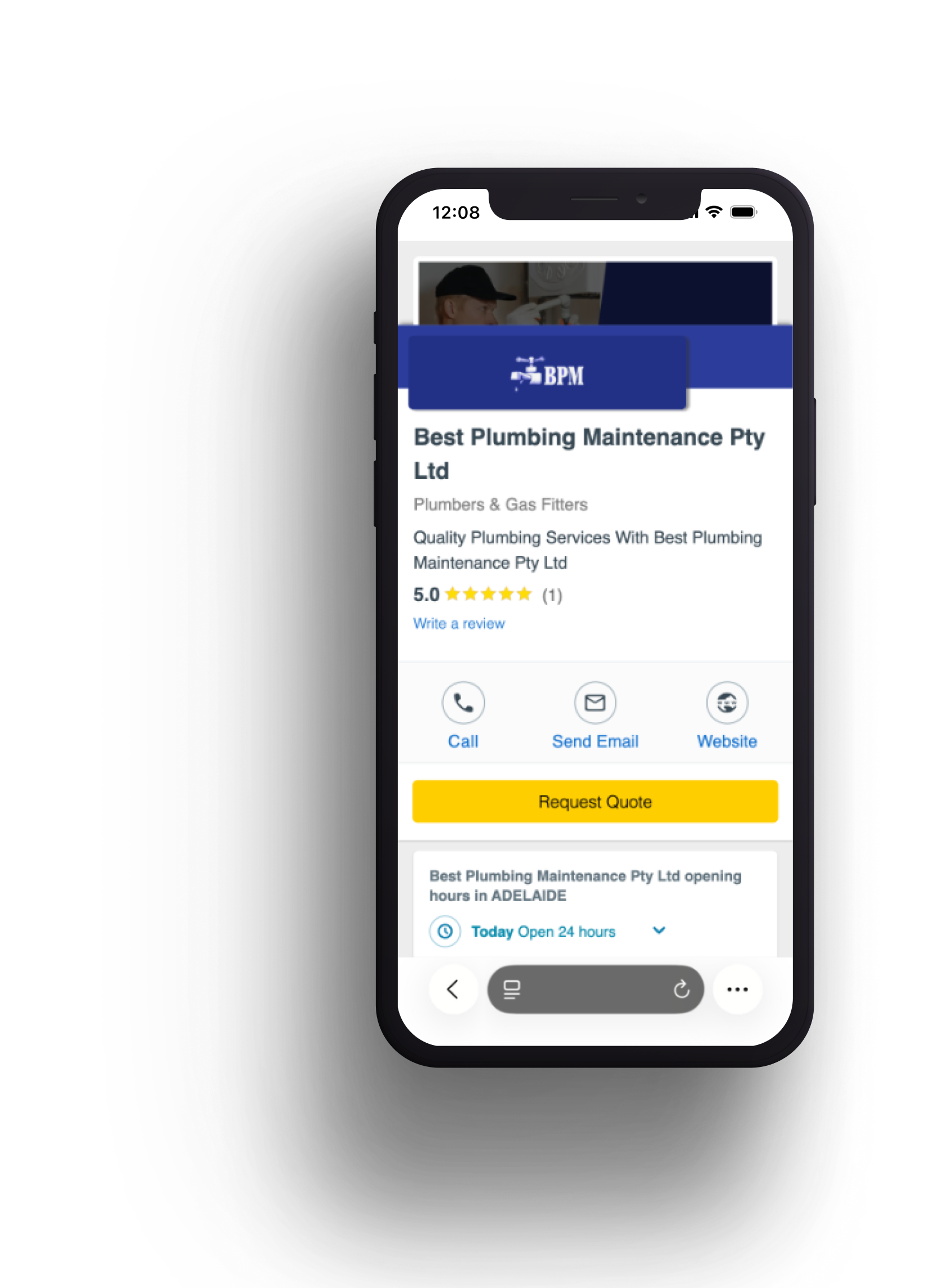
Before
After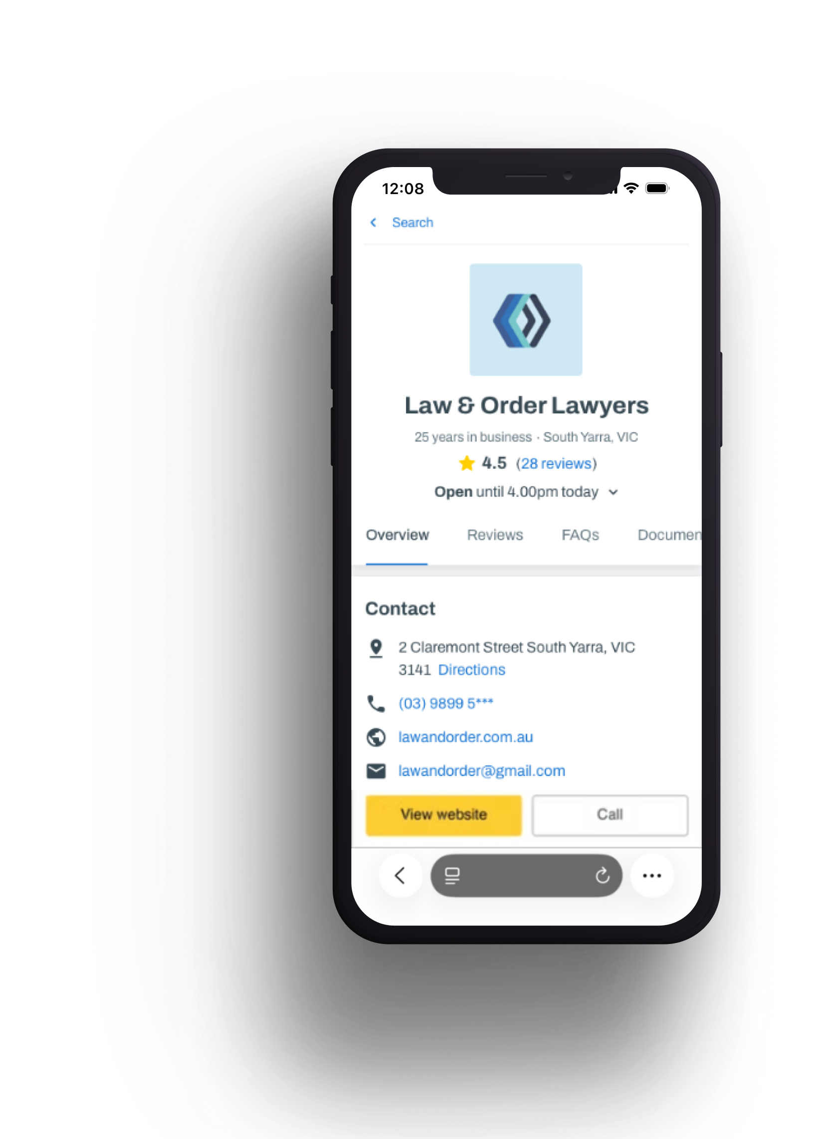
Making research stick
The most valuable research is the kind that outlives the project. From the start, I focused on building structures that would keep these insights alive and useful across the organisation, long after the immediate design work was done.01
Research showcases
Regular showcases throughout the project brought stakeholders from every discipline into the CX journey - building empathy for users, sparking curiosity about research as a practice, and giving teams insights they could immediately apply to their own work.02
Centralised research repository
I established a structured Dovetail repository that made insights and user quotes self-serve. Product managers began referencing it directly to inform other projects - creating a lasting shift in how the team treated and valued research evidence.03
Living journey map
The journey map I created was designed as a continuously updated document - not a static deliverable. It aligned stakeholders on user needs across the organisation and became a reference point the team returned to when making product decisions long after the project wrapped.06. Reflection
Reflection
The harder challenge on this project wasn't finding the insights - it was making sure they reached the right people in a form they could actually use. A research report delivered at the end of a project is already fighting against momentum and competing priorities. Building showcases, repositories, and journey maps alongside the research meant the insights were working from day one.The scenario-based interview approach was particularly effective at cutting through the gap between what people say they do and what they actually do. In future projects I'd push for even more scenario depth - particularly for high-anxiety, infrequent decisions like hiring a tradesperson, where real behaviour diverges most sharply from self-report.